-
[CSS Grid] auto-fill, auto-fit 으로 반응형 만들기카테고리 없음 2021. 9. 3. 12:13
auto-fill 과 auto-fit
auto-fill 과 auto-fit 은 모두 repeat() 에서 사용하는 값.
auto-fill 은 해당 row 에서 column 이 있는 한 많이 채움.
auto-fit 은 해당 row 안에서 현재의 요소의 크기를 늘려서 너비에 맞게 채움.
## HTML
auto-fill
    <div class="grid auto-fill">
      <div class="item">1</div>
      <div class="item">2</div>
      <div class="item">3</div>
      <div class="item">4</div>
      <div class="item">5</div>
      <div class="item">6</div>
    </div>
    auto-fit
    <div class="grid auto-fit">
      <div class="item">1</div>
      <div class="item">2</div>
      <div class="item">3</div>
      <div class="item">4</div>
      <div class="item">5</div>
      <div class="item">6</div>
    </div>
.grid { color: white; display: grid; gap: 5px; grid-auto-rows: 100px; margin-bottom: 30px; } .item:nth-child(odd) { background-color: skyblue; } .item:nth-child(even) { background-color: blueviolet; } .auto-fill { grid-template-columns: repeat(auto-fill, minmax(100px, 1fr)); } .auto-fit { grid-template-columns: repeat(auto-fit, minmax(100px, 1fr)); }예시 1. 작은 화면


auto-fill 과 auto-fit 모두 최소 사이즈를 100px 로 제한했기 때문에 100px 에 맞추어 column 이 줄어들고 row 가 늘어나는 모습. 작은 화면에서는 별반 차이가 없음.
예시 2. 큰 화면
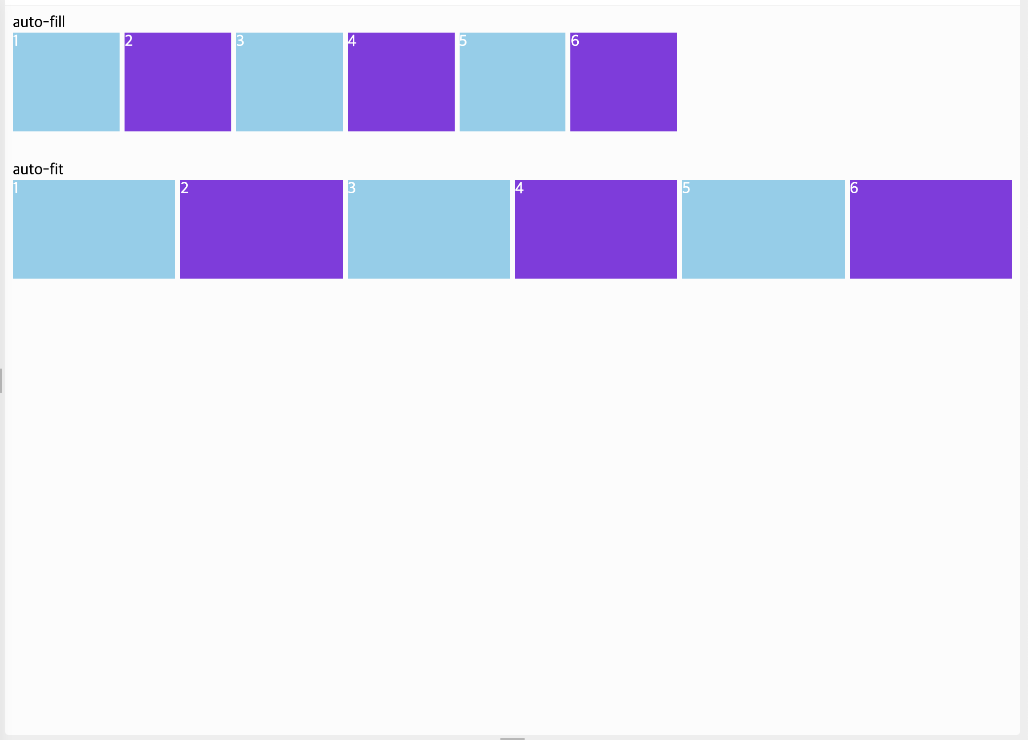
여기서 차이가 드러나는데, auto-fill 은 말 그대로 채우는 것. 반면, auto-fit 은 너비를 늘려서 맞춤하는 것.